
Choosing colors for your coloring book shouldn’t feel overwhelming. This guide provides 5 proven methods, practical color theory basics, and professional techniques to help you select perfect palettes every time whether you’re a complete beginner or experienced colorist.
Quick Answer
Use 8-12 colors per page including neutrals. Start with one dominant color, add 2-3 related colors (analogous or complementary), include 1-2 neutrals, and finish with 1-2 accent colors. Test your palette on scrap paper before starting.
Table of Contents
- Why Color Selection Feels Overwhelming
- Essential Color Theory Basics
- 5 Proven Color Selection Methods
- Building Balanced Color Palettes
- Common Mistakes to Avoid
- Color Strategies by Theme
- Recommended Tools and Resources
- Frequently Asked Questions
Why Color Selection Feels Overwhelming
Three factors make choosing colors difficult:
Decision Paralysis from Too Many Options
Research shows that excessive choice leads to anxiety and dissatisfaction. A 24-count pencil set often produces better results than a 150-count collection because fewer options reduce decision stress.
The Permanence Factor
Unlike erasable sketches, colored pencils and markers feel permanent. This transforms every color decision into high-stakes pressure, freezing you before you even start.
Lack of Formal Training
Most people never learned color harmony principles. We’re expected to intuitively know what works, but successful color combinations follow specific, learnable patterns.
The solution? Understanding basic color relationships and using systematic selection methods eliminates guesswork.
Essential Color Theory Basics
You need just four concepts to choose harmonious colors confidently.
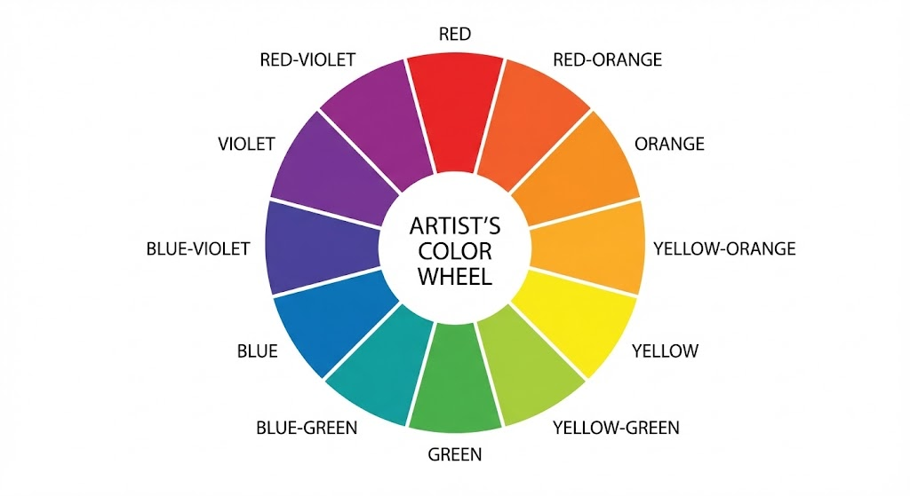
Understanding the Color Wheel
The color wheel maps how colors relate to each other:
- Primary colors (red, yellow, blue): Cannot be mixed with other colors
- Secondary colors (orange, green, purple): Created by mixing two primaries
- Tertiary colors: Fill gaps between primaries and secondaries
You don’t need to memorize the wheel, just understand these four relationships:
Four Key Color Relationships
- Complementary Colors (Opposite Pairs)
Colors directly across the wheel create strong contrast: blue and orange, red and green, purple and yellow.
When to use: Making focal points pop, adding energy, creating vibrant contrast
Pro tip: Use one color for 70% of your page, the complement for 30% accent. Equal amounts create visual conflict.
- Analogous Colors (Neighbors)
Colors sitting next to each other harmonize naturally: blue, blue-green, green; or red, red-orange, orange.
When to use: Peaceful scenes, cohesive looks, when you want foolproof harmony
Why it works: These colors share common pigments, so they naturally blend together.
- Triadic Colors (Three Equal Spaces)
Three colors equally spaced create vibrant balance: red, yellow, blue; or orange, green, purple.
When to use: Geometric patterns, mandalas, designs needing variety with harmony
Application: Often one color dominates while the other two serve as accents.
- Monochromatic (One Color Family)
Different values of a single hue: light blue, medium blue, navy blue.
When to use: Elegant, sophisticated results; simplifying decisions; focusing on shading technique
Surprising fact: Monochromatic schemes often look more professional than multi-color attempts.
Temperature: Warm vs Cool
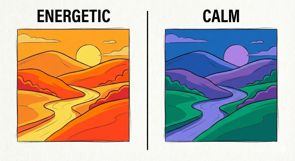
Warm colors (reds, oranges, yellows): Energetic, cozy, advance toward viewer
Cool colors (blues, greens, purples): Calm, spacious, recede into background
The 70/30 Rule: Choose a temperature and use it for 70-80% of your page. Add 20-30% opposite temperature for accent.
Example: A cool ocean scene (70% blues and greens) with warm sunset highlights (30% oranges and yellows).
The Secret Weapon: Neutrals
Black, white, gray, brown, and cream make your colored areas more vibrant by providing visual rest.
According to color psychology research, the human eye needs neutral spaces to fully appreciate saturated colors. Without neutrals, even beautiful palettes look chaotic.
Try this: Use color for 70-80% of your page, neutrals for 20-30%.
5 Proven Color Selection Methods
Choose one method per session to eliminate decision paralysis.
Method 1: The Limited Palette Approach
How it works: Select only 8-12 colors before starting and set everything else aside.
Step-by-step process:
- Choose one dominant color you’re excited to use
- Select 2-3 related colors (analogous or complementary)
- Add 1-2 neutrals (cream, gray, light brown)
- Pick 1-2 accent colors for small details
- Put away remaining supplies
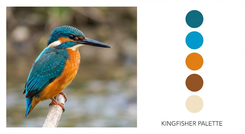
Real example of a bird design:
- Dominant: Medium blue (bird body)
- Related: Light blue, navy, teal
- Neutrals: Cream, light brown
- Accents: Burnt orange (beak), yellow-green (leaves)
Result: Eight colors create cohesion through repetition instead of introducing constant new hues.
Beginner variation: Start with just 5-6 colors. Constraint breeds creativity.
Method 2: Inspiration-Based Selection
How it works: Extract proven color combinations from existing sources and recreate them.
Professional designers use this constantly . You’re not cheating, you’re learning from masters.
Top inspiration sources:
- Nature photography: Sunsets, flowers, landscapes, seasonal changes
- Design Seeds (designseeds.com): Extracts palettes from beautiful photographs
- Pinterest: Search “color palette + [theme]”
- Adobe Color: Upload any image to extract its palette
- Magazine advertisements: Created by professional color experts
- Your environment: Clothing, home decor, artwork you love
Implementation steps:
- Find an inspiring image
- Identify 4-6 dominant colors
- Match them to your supplies (hold pencils to screen)
- Keep the reference visible while coloring
- Adjust saturation/value to match your medium
Example: A autumn leaf photo yielded burnt orange, deep red, golden yellow, and brown creating one of the most harmonious pages possible.
Method 3: Color Wheel Tool Method
How it works: Use physical or digital tools to mathematically determine harmonious combinations.
Recommended tools:
- Physical color wheel: $5-15 at craft stores (Pocket Color Wheel is excellent)
- Coolors.co: Free website press spacebar for random palettes
- Adobe Color: Professional tool with scheme generators
- Color Hunt: Curated trendy palettes
Process with physical wheel:
- Locate your chosen base color
- Identify complements (opposite) or analogs (adjacent)
- Note specific color names
- Match to your supplies
- Test combinations on scrap paper
Example: Starting with purple:
- Wheel shows yellow as complement
- Pull light lavender, medium purple, deep plum
- Pull pale yellow, golden yellow, mustard
- Add gray neutral
- Complete palette in 3 minutes
Why this works: Mathematical color relationships guarantee harmony.
Method 4: Random Selection Challenge
How it works: Randomly grab 6-8 colors with eyes closed.
Purpose: Breaks habitual patterns and forces creative problem-solving with unexpected combinations.
Guidelines:
- Close eyes, select 6-8 tools randomly
- Open eyes and assess what you have
- Replace only if 5+ are nearly identical
- Add one neutral if needed
- Commit to using only these colors
Unexpected success example: Hot pink, sage green, mustard yellow, navy blue, cream, brown a combination never consciously chosen but surprisingly beautiful.
When to use: Practice pages, breaking color ruts, adventurous moods, skill-building exercises.
Method 5: Realistic Reference Method
How it works: Match colors to high-quality reference photographs for accuracy.
Essential for: Animals, portraits, botanical accuracy, landscapes, learning color observation
Critical insight: Realistic subjects require more colors than expected. A red apple needs burgundy (shadows), bright red (mid-tones), orange-red (edges), pink (highlights), and cream (brightest spots).
Process:
- Find high-resolution reference (Unsplash, Pexels)
- Study light source and shadow placement
- Observe actual shadow colors (usually complement, not black)
- Identify highlight colors (typically warm cream/pale yellow)
- Match supplies to reference
- Keep photo visible throughout
Shadow color principle: Yellow objects have purple shadows. Orange objects have blue shadows. White objects have blue or gray shadows. Using complement colors for shadows creates realism black cannot achieve.
Building Balanced Color Palettes
These strategies transform good color choices into professional-looking results.
The 60-30-10 Distribution Rule
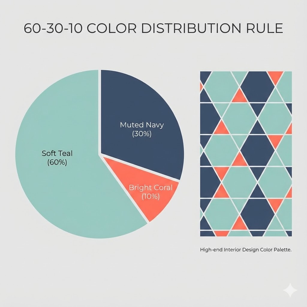
Professional designers use this proportion formula:
- 60% Dominant color: Sets mood, covers most area
- 30% Secondary color: Supports dominant, creates balance
- 10% Accent color: Small pops for interest
Garden scene example:
- 60%: Various greens (foliage, stems, grass)
- 30%: Blues (sky, some flowers, shadows)
- 10%: Bright coral (focal flowers, key details)
This prevents chaos (too many equal colors) and boredom (single color domination).
Include Light, Medium, AND Dark Values
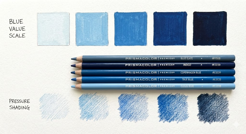
Value (lightness/darkness) matters as much as hue (color name).
The squint test: Squint at your chosen palette. Can you see clear light/dark differences, or does everything blur together?
Value requirements per palette:
- Minimum one very light color (highlights, breathing room)
- Several medium values (workhorses)
- Minimum one very dark color (depth, shadows)
Practical example “Blue” needs:
- Sky blue (light value)
- True blue (medium value)
- Navy blue (dark value)
This single adjustment creates dimension instead of flat, monotone results.
Repeat Colors Throughout Your Page
Repetition creates cohesion by connecting disparate elements visually.
How to use repetition:
- Use purple in flower petals, echo it in leaf shadows and butterfly wings
- If sky is blue, add blue to water, clothing details, or background objects
- Repeat accent colors 3-5 times in different areas
This creates visual rhythm viewers’ eyes travel around the page following repeated colors, creating satisfaction.
Test Before Committing
Always create swatches before applying colors to your actual page.
Testing process:
- Use scrap paper or books inside the back cover
- Create small color samples
- Place swatches adjacent to each other
- Observe for one minute minimum
- Ask: Do these harmonize? Sufficient contrast? Any jarring combinations?
- Adjust as needed
Why this matters: Two minutes of testing prevents hours of disappointment. Colors look different in isolation versus combination.
Common Mistakes to Avoid
Learning from these errors saves frustration and wasted materials.
Mistake #1: Using Too Many Colors
The problem: 20+ colors per page creates visual chaos where nothing stands out.
Why it fails: According to gestalt psychology principles, the human brain groups similar elements. Too much variety prevents pattern recognition, creating viewer fatigue.
Solution: Maximum 12 colors including neutrals. Often 6-8 is ideal.
Comparison: Would you wear 15 different colors in one outfit? The same principle applies to coloring.
Mistake #2: Skipping Neutrals
The problem: Only bright, saturated colors create exhausting visual noise.
Real example: A page using only intense blues, purples, pinks, and yellows every section competed for attention, making it unpleasant to view.
Solution: Include cream, soft gray, or light brown for at least 20% of your page. Leave some areas white.
Why it works: neutrals don’t reduce impact they enhance bright colors through contrast and provide visual rest areas.
Mistake #3: Black Shadows Everywhere
The problem: Pure black shadows look harsh and two-dimensional.
Color theory fact: In nature, shadows contain the complement of the illuminated color. Sunset shadows appear purple/blue, not black.
Better shadow colors:
- Yellow objects: Purple or blue shadows
- Red objects: Dark green or brown shadows
- Blue objects: Orange or brown shadows
- General purpose: Dark purple or navy (softer than black)
Result: This single change makes coloring appear more sophisticated and dimensional.
Mistake #4: Ignoring Mood and Context
The problem: Selecting colors without considering desired emotion or atmosphere.
Failed example: Bright neon pink, electric blue, and lime green on a peaceful meditation mandala the colors created chaos opposite to the intended calm.
Solution by mood:
- Peaceful/Calm: Cool blues, soft greens, lavender, ample white space
- Happy/Energetic: Warm yellows, oranges, bright pinks, high contrast
- Mysterious/Dramatic: Deep purples, dark blues, black accents, low saturation
- Natural/Grounded: Browns, greens, muted earth tones, organic variety
Let emotion guide palette before technique.
Mistake #5: Premature Judgment
The problem: Deciding colors “don’t work” at 10-15% completion.
Why this fails: Colors need context. That “too bright” pink often looks perfect surrounded by greens and neutrals at 75% completion.
Solution: Complete minimum 40-50% before evaluating. Colors interact and balance each other as coverage increases.
Permission: If you genuinely dislike results at 50%? That’s valuable learning for next time.
Mistake #6: Ignoring Medium Characteristics
The problem: Expecting identical results across different materials.
Medium-specific behaviors:
Colored pencils:
- Layer extensively with light pressure
- Can apply light over dark with effort
- Gradual blending ideal
- Most forgiving for beginners
Alcohol markers:
- Highly saturated and vibrant
- Rapid bleeding/blending
- Must work light to dark (cannot lighten)
- Colors appear different when dry
Gel pens:
- Bold, opaque coverage
- Minimal blending capability
- Excellent for accents from other media
- WYSIWYG (what you see is what you get)
Solution: Consider medium characteristics during palette selection. Beautiful pencil palettes may become overwhelming in marker.
Color Strategies by Theme
Different subjects benefit from specific color approaches.
Florals and Gardens
Realistic flower approach:
- Use 3-4 shades per flower color (light, medium, dark, very dark)
- Add complement color hints for depth (pink flowers with yellow-green touches)
- Real flowers show color variation within each petal
Foliage strategy:
- Never use single green
- Minimum three greens: yellow-green (sunlit), true green (mid-tone), blue-green/olive (shadows)
Background options:
- Soft neutral (cream, pale gray) makes flowers pop
- Analogous color (blue behind purple flowers, yellow behind orange)
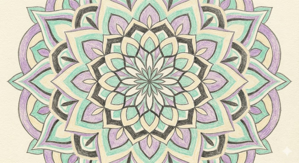
Mandalas and Geometric Patterns
Symmetrical coloring:
- Select 3-5 colors, repeat in consistent pattern
- Start at center, work outward maintaining symmetry
Gradient technique:
- Begin with lightest value at center
- Gradually darken moving outward
- Single color family creates stunning depth
Organization method:
- One color family for center ring
- Different family for middle ring
- Third family for outer ring
Critical tip: Color one complete section first to test pattern before committing to entire mandala.
Animals and Wildlife
Realistic requirements:
- Reference photo is non-negotiable
- Animal fur/feathers contain incredible color complexity
- Brown bear = golden highlights + chocolate mid-tones + sepia shadows + cream accents
Shadow technique:
- Use complement for shadows (blue in orange fur, purple in yellow fur)
- Keep complement subtle too much looks unnatural
Eye technique (makes or breaks animal portraits):
- Use 3-4 shades of eye color
- Always include white highlight
- Use very dark outline (dark brown or navy, not black)
Landscapes and Scenery
Time-of-day color schemes:
Sunrise/Sunset:
- Warm palette dominates (yellows, oranges, pinks, purples)
- Cool shadows (blue or purple) this contrast creates drama
- Reflected warm light on objects
Midday:
- Bright, saturated colors throughout
- Strong value contrasts
- Shadows remain cool (blue/purple, never black)
Evening/Twilight:
- Cool blues and purples dominate
- Warm colors (streetlights, lit windows) become focal points
- Muted, darker values overall
Overcast:
- Desaturated colors throughout
- Minimal value contrast
- Gray-blues create peaceful, soft mood
Fantasy and Imaginative Art
Bendable but not breakable rules:
- Purple trees acceptable
- Neon pink cats acceptable
- Still need value contrast for dimension
- Still need cohesive palette for unity
- Still benefit from neutrals
Popular fantasy palettes:
- Magical forest: Purples, teals, magentas + gold accents
- Fire dragon: Reds, oranges, yellows + black and deep purple
- Underwater fantasy: Blues and greens + unexpected neon accents
- Fairy tale: Pastels + jewel tone accents for magic elements
The commitment principle: Purple tree needs purple shadows and purple highlights. Mixing realistic and fantasy approaches looks confused and half-hearted.
Recommended Tools and Resources
Practical tools that simplify color selection.
Physical Tools
Color Wheels ($5-15):
- Basic paper wheels from any craft store
- Brand-specific versions (Prismacolor, Copic) match your supplies
- Reference weekly for harmonious choices
Personal Swatch Book:
- Color small squares of every tool you own
- Label with color names/numbers
- Saves hours testing individual colors
Pre-sorted Palettes:
- Small ziplock bags organized by theme
- “Warm colors,” “Cool colors,” “Autumn palette,” etc.
- Grab and start instead of sorting through everything
Digital Tools (All Free)
Coolors.co:
- Press spacebar for random palette generation
- Keep pressing until you find inspiring combinations
- Export palettes for reference
Adobe Color (color.adobe.com):
- Professional color wheel tool
- Generate specific schemes (complementary, triadic, etc.)
- Browse thousands of user-created palettes
- Upload photos to extract palettes
Pinterest:
- Search “color palette + [any word]”
- Create boards: “Autumn palettes,” “Ocean colors,” “Soft pastels”
- Visual inspiration when needed
Color Hunt (colorhunt.co):
- Curated trendy palettes
- Updated daily
- Modern, current combinations
Online Inspiration Sources
Design Seeds (design-seeds.com):
- Beautiful photograph-based color palettes
- Professional quality
- Free for personal use
Unsplash and Pexels:
- High-quality free photography
- Use for realistic references and color inspiration
- No attribution required
Community Resources
Facebook Groups:
- Adult Coloring Worldwide (highly active)
- Colorists Anonymous (excellent technique discussions)
- Brand-specific groups for your preferred supplies
YouTube Channels:
- Kirsty Partridge Art (advanced techniques, clear instruction)
- Sarah Renae Clark (comprehensive tutorials, all skill levels)
- Vanilla Arts Company (marker-specific techniques)
Instagram Hashtags:
- #adultcoloring
- #coloringbookaddict
- #copiccoloring (for markers)
- #prismacolor (for these pencils)
Build Your Personal System
Keep a coloring journal:
- Photograph finished pages
- List colors used with names/numbers
- Note what worked and what didn’t
- Save palette ideas for future use
Benefits: After months of journaling, you’ll have 20-30 proven “go-to” palettes. When you don’t want to decide, simply choose from your successful history.
Frequently Asked Questions
How many colors should I use per page?
Answer: 8-12 colors (including neutrals) works best for most projects.
Beginners benefit from starting with just 5-6 colors. More than 15 colors typically create chaos rather than sophistication. The goal is intentional variety, not random abundance.
Can I mix different coloring mediums?
Answer: Yes, with proper technique.
Works well:
- Markers first, colored pencils on top (adds texture and detail)
- Very light colored pencil, markers over (only if pencil barely visible)
- Gel pens over anything (fine details and highlights)
Avoid:
- Heavy colored pencil under markers (tears paper)
- Watercolor pencils + alcohol markers (messy bleeding)
Always test combinations on similar paper first.
What if my colors look bad together?
First: Complete more of the page. Colors appear different in isolation than when surrounded by others. Many “terrible” 30% pages become beautiful at 80%.
If genuinely dislike at 50% completion:
- Add neutral (cream or gray) to calm intensity
- Use problematic color only with tiny accents
- Remember, this is practice learning what doesn’t work has value
- Finishing “bad” pages teaches more than abandoning them
Should I color realistically or use creative colors?
Answer: Both approaches have merit choose based on your goal.
Realistic coloring when:
- Practicing technique and skill development
- Enjoying the challenge of matching reality
- Working with subjects naturally suited to realism (animals, portraits)
Creative coloring when:
- Prioritizing relaxation over accuracy
- Working with fantasy or abstract designs
- Wanting to experiment and play
Many colorists do both depending on mood and project. Neither is superior.
How do I make coloring look more professional?
Five critical elements:
- Value contrast: Use lights, mediums, and darks (not all one value)
- Limited palette: Fewer colors used thoughtfully beats many used randomly
- Logical lighting: Choose light source, shade consistently
- Smooth blending: Eliminate harsh color transition lines
- Strategic neutrals: Don’t color every single space
Professional results paradoxically come from using fewer colors more intentionally.
Do I need expensive supplies for good color selection?
Answer: Absolutely not.
Color theory works identically whether using budget Crayola or premium Copic markers. Expensive supplies offer more color options and better blending, but don’t make color decisions for you.
Basic 24-count sets with solid color understanding outperform $300 collections used randomly.
Smart approach: Start with current supplies. Learn principles. Upgrade individual colors as you identify specific needs, not by purchasing huge expensive sets.
How do I choose colors for unfamiliar subjects?
Process:
- Search Google Images or Pinterest for subject
- Find 2-3 reference images you like
- Identify common colors across references
- Extract 4-6 color palette from favorite reference
- Match to your supplies
- Test on scrap paper
When uncertain, let references guide you. Creativity comes after understanding.
Can I use black in coloring?
Answer: Sparingly, yes.
When black works:
- Very small details (pupils, thin outlines)
- Creating strong contrast in specific spots
- Some backgrounds
Avoid black for:
- Large filled areas (too harsh)
- Shadows (use complements instead)
- General shading (too heavy)
Dark purple or dark blue usually looks more sophisticated than black. Black colored pencils last years because rarely needed.
What if I hate planning and want to just color?
Answer: Then just color!
Planning is optional, not mandatory. Not every session requires pre-planning.
When planning helps:
- Important or expensive pages
- Complex projects
- When feeling uncertain
- Wanting professional results
When to skip planning:
- Casual relaxation coloring
- Practice pages
- When decision fatigue sets in
- Tuesday evening de-stress sessions
Choose colors that make you happy and start. There’s no wrong way to color for enjoyment.
How can I practice color selection skills?
Most effective practice: Color the same image 5 times with 5 completely different palettes. Direct comparison teaches color relationships faster than any other method.
Additional practice methods:
- Impose restrictions (only cool colors, only 4 colors, only neutrals + one accent)
- Copy palettes from professional artwork you admire
- Quick 10-minute color studies instead of full detailed pages
- Color one section multiple ways before committing to entire page
Deliberate practice beats mindless repetition. One focused hour of experimentation teaches more than ten hours of habit.
Your Color Selection Action Plan
For Your Next Coloring Session:
- Choose ONE method from this guide (Limited Palette recommended for beginners)
- Select 6-8 colors using the chosen method
- Add 1-2 neutrals
- Test palette on scrap paper
- Begin coloring
This Week:
- Create swatches of all your coloring tools
- Save 5-10 color palettes from Pinterest or Design Seeds
- Try one new selection method
This Month:
- Color 4 practice pages using 4 different methods
- Join one online coloring community
- Start a simple coloring journal documenting successes
Final Thoughts
Choosing colors for coloring books doesn’t require natural talent or formal art education. Success comes from understanding basic principles and having reliable methods.
Key takeaways:
- Limit palette to 8-12 colors for cohesion
- Include neutrals to make colors pop
- Use light, medium, and dark values (not just different hues)
- Find your preferred method and practice it
- Let go of perfection enjoy the process
The perfect palette isn’t the technically correct one, it’s the one that brings you joy while creating it.
Every page you color improves your color sense, including the “mistakes.” That uncertain page will teach you more than any perfect page could.
Start with one method from this guide, trust yourself, and create something colorful today.
About This Guide: This resource combines classical color theory with practical coloring techniques, drawing from professional design principles and adult coloring community best practices.
Word Count: ~5,500 words | Reading Time: 22 minutes | Skill Level: Beginner to Advanced
Have questions about color selection? Leave a comment below I respond to every question.